ISEI: a beauty store for the Polish market
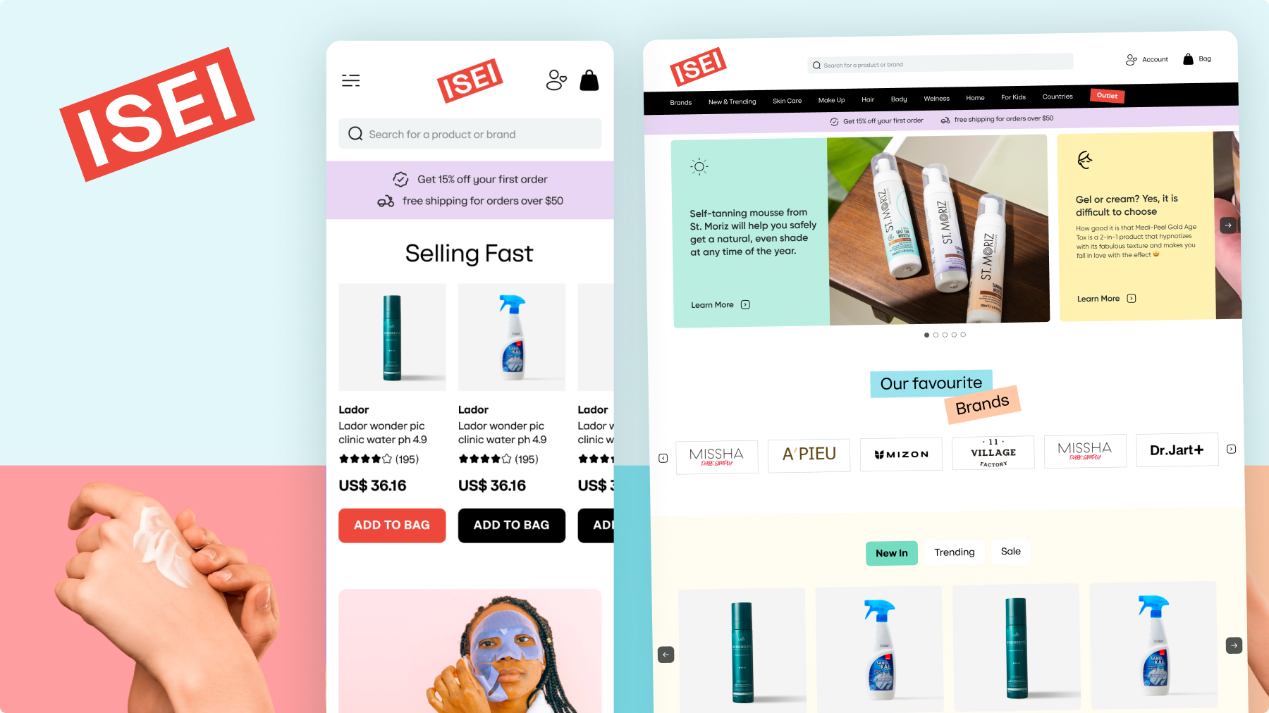
Fifty-five stores in Ukraine, a brand nobody in Warsaw had heard of yet, and a plan to open the website before the doors. I designed the whole thing, desktop and mobile.
Where it started
ISEI sells Asian beauty: Korean and Japanese skincare, around 70% of it imported. In Ukraine it had grown into 55 stores, roughly 200 people, and every city over a million. The next market was Poland, and the plan was unusual for a retail chain: test online first, open the physical store later. The Warsaw shop came in November 2024. The website came before it.
They came to me on a recommendation from the OVO founders. Most of my e-commerce work arrives that way.
Sources: RAU on the chain and the Warsaw store · AIN.Business on the brand
Two markets, two jobs
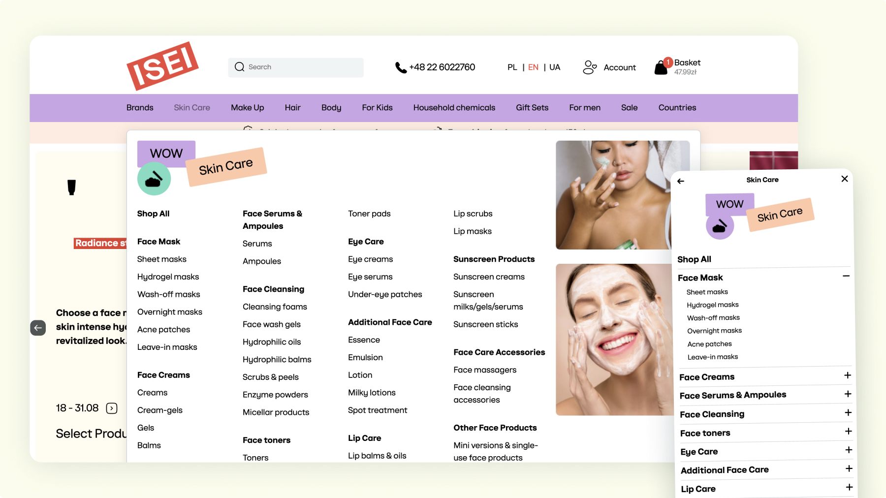
The Ukrainian site was doing something else, and doing it well. At home ISEI is a name people already know, so the storefront can lead with price: discounts, promo carousels, «brand of the week», a hotline number in the header.
In Poland none of that meant anything yet. The name carried no weight, the discounts had nothing to be compared against, and the audience was choosing between a dozen K-beauty shops that all looked the same. The Polish store had a different job: explain the assortment to someone meeting it for the first time.
Shop by concern
People don’t wake up wanting a Numbuzin toner. They wake up with dry skin, or a breakout, or the first fine lines.
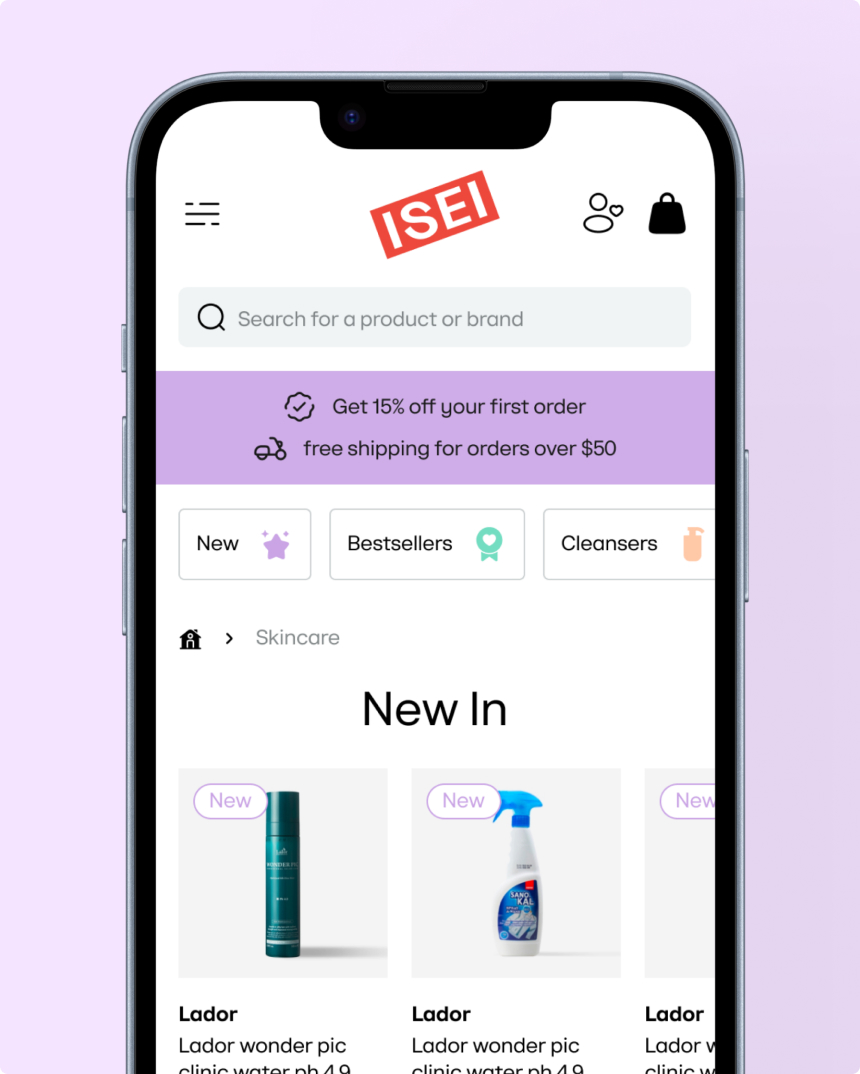
So the site sorts the catalogue the way the customer already thinks: hydration, whitening, acne-prone, anti-ageing. Each concern gets a photograph of texture, not a product shot, because texture is what people recognise before they know brand names.
Ingredients as a way in
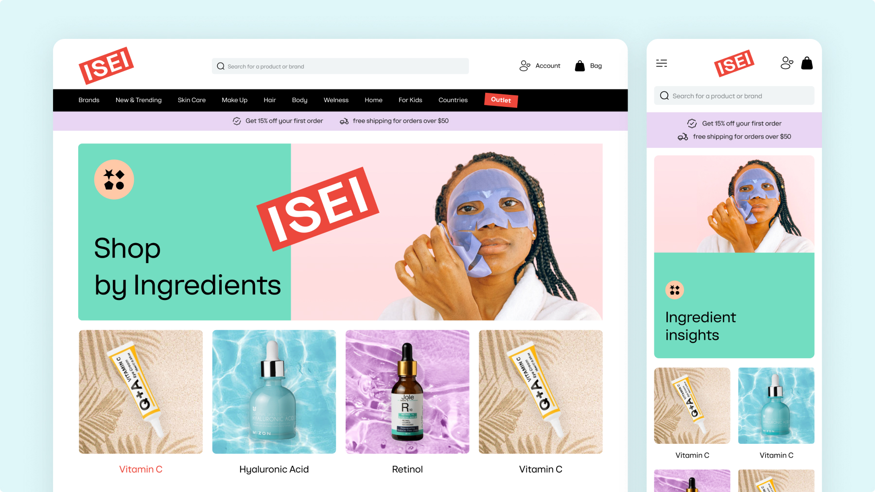
The K-beauty audience reads labels. Hyaluronic acid, collagen, centella, peptides: these are the words people search for, screenshot and send to friends.
In the shops I looked at, ingredients were buried in the product description. Here they became a navigation layer of their own, so someone who came for centella can find every product with centella in it, across all brands.
Letting the brand talk
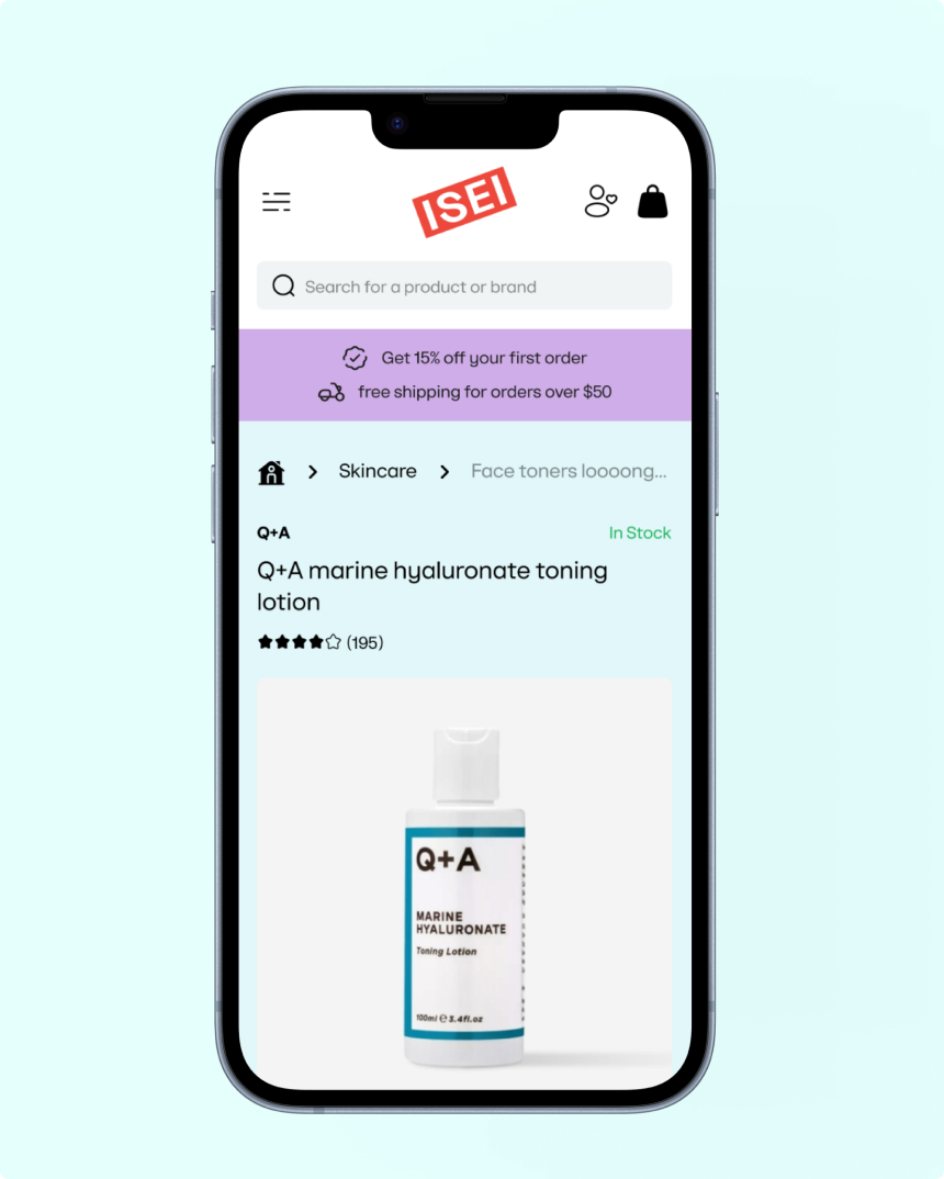
The identity gave me a red stamp of a logo and permission to be playful, so the pages have small pieces of voice: hand-cut sticker labels on section titles, warm colour blocks per category, editorial headings written like a person talking rather than a shop shouting.
Nothing heavy. On a market where every competitor looks like a pharmacy, a little personality does more than another banner.
The checkout, in local terms
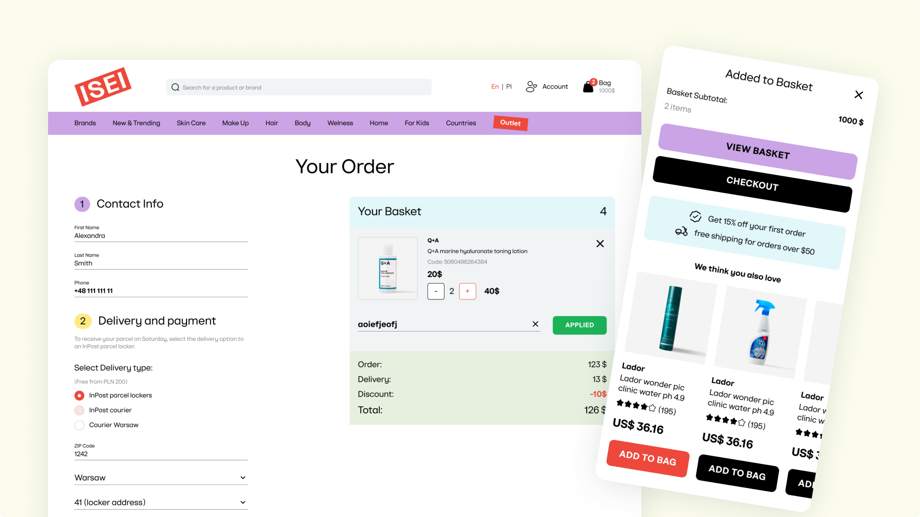
The country has its own shopping habits, and the checkout had to know them: InPost parcel lockers as the default delivery, Przelewy24 and BLIK next to the card, a NIP field for people buying through a company, and a delivery date you pick from a row.
The basket stays beside the form the whole way, and one checkbox lets you ask for the gift packaging, because a lot of beauty orders are presents.
The unglamorous half
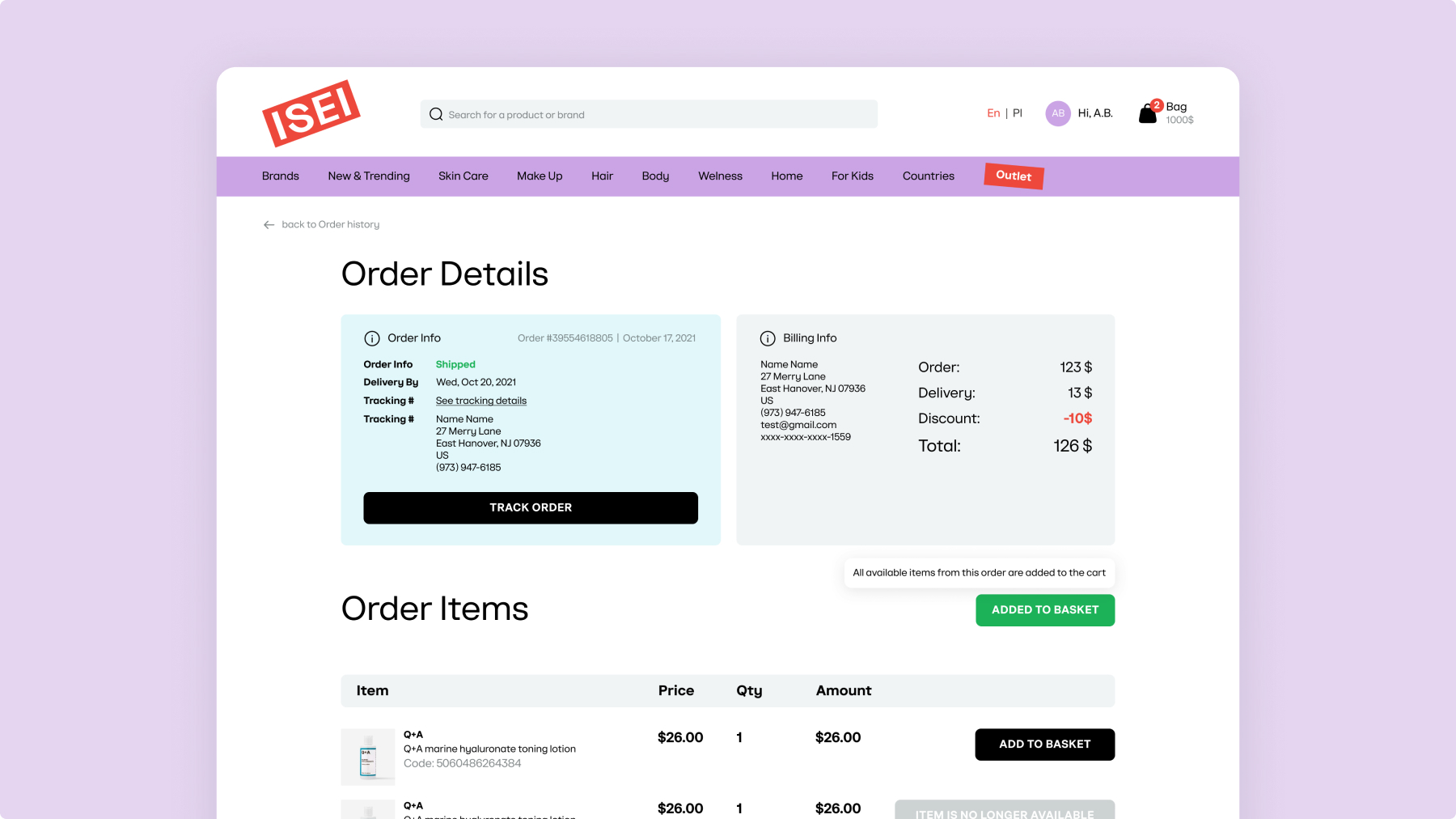
A store is more than a catalogue, so the account area got the same attention as the front page: order history with real statuses, tracking, wishlist, saved addresses, return requests, and Beauty Points sitting where people look for them.
Nobody screenshots an account page. But it’s where customers go when something has gone wrong, or when they want the same thing again, and that’s most of what keeps a shop alive.
What came out of it
desktop and mobile
Catalogue, product pages, checkout, account area. Designed in 2023.
Running in three languages: Polish, English, Ukrainian.
opened the market
Poland went online first; the Warsaw store followed in November 2024.
The Polish site is part of that chain’s expansion out of Ukraine.
Sources: RAU · AIN.Business