OVO: from a $55 landing page to Ukraine’s biggest grocery chain
A lockdown experiment between friends that grew into a delivery brand people posted about. I designed almost all of it: the store, the characters, the packaging, and the warehouse tools behind the scenes.
Where it started
April 2020. Kyiv is locked down, the founders are friends of mine, and everyone suddenly needs vegetables delivered. The hypothesis: will people order fresh produce online from people they’ve never met? We spent $55, put together a one-page site in a week, and let Kyiv answer.
Kyiv said yes.
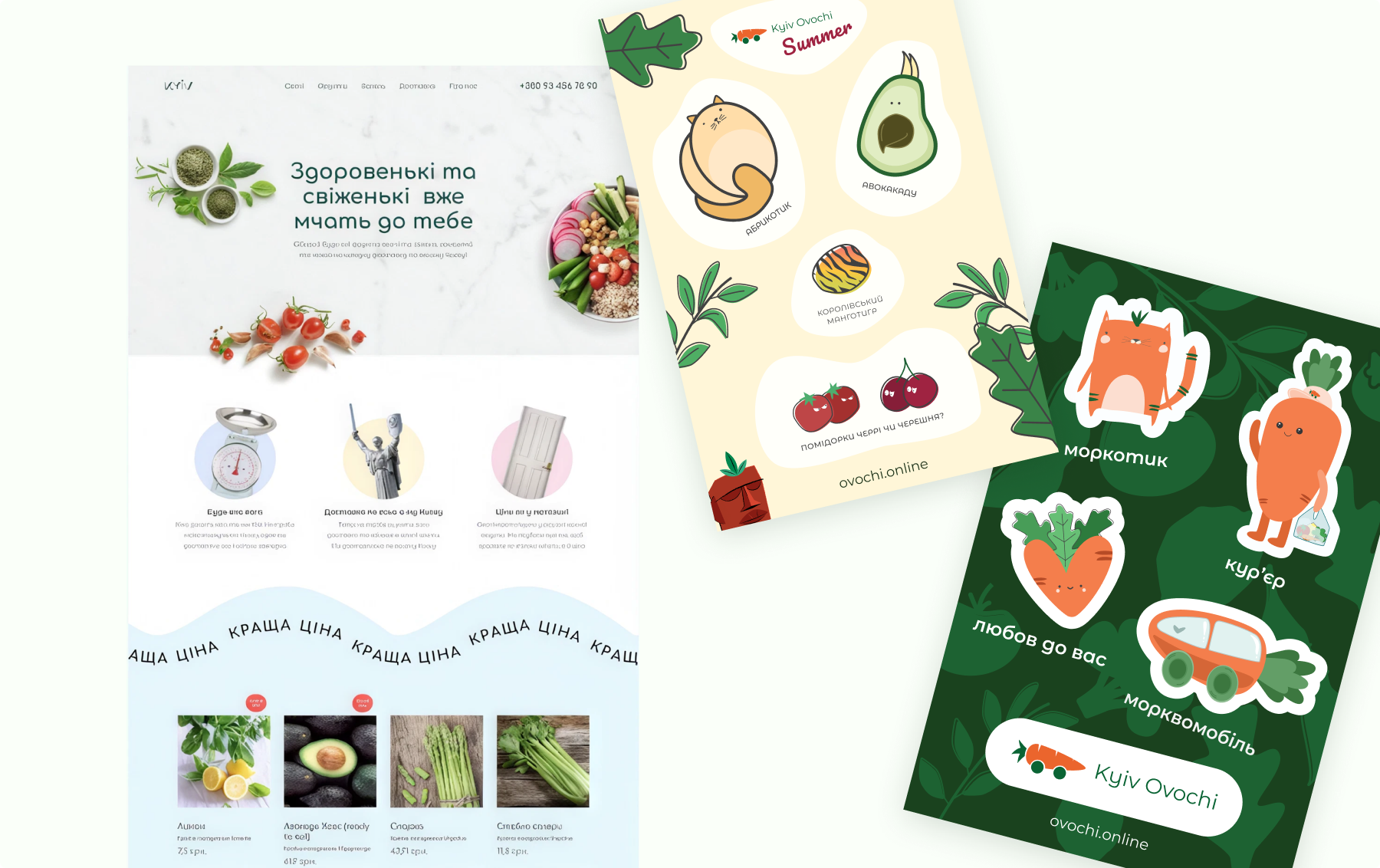
A shop on one page
That first site was a landing page pretending to be a store, and I designed it around a simple picture: you walk along the shelves and drop things into your basket as you go. One continuous page, produce in the order you’d meet it in a market, basket always in reach.
We also put hand-drawn stickers and little surprises into the orders. I drew them myself. People started posting them.
Enter Fedoriv
Fedoriv Group, a Kyiv creative agency, noticed the packaging and the blogger posts and came in as an angel investor. They gave the brand its core: the OVO name, the logo, the first characters.
My job was to take that core and turn it into a living system. Dozens of new characters, the packaging line, print, banners, motion. And the entire product around it: the store, the cabinet, and the tools nobody sees.
Building the real store
With the money we built a real store, and made a few decisions I still like today.
Search that sells. You could add products to the basket straight from search results, with weight steps right there. For a shop where people buy the same tomatoes every week, that shortcut mattered more than any homepage.
Buying by weight, honestly. Nobody knows what 500 g of tomatoes looks like. Cards showed the average weight of one item, and you ordered 500 g or 2 kg without doing math.
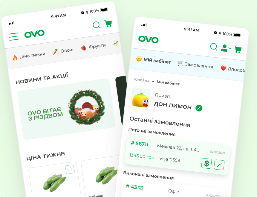
Mobile first, no app. Most orders came from phones, so the site was built as the app. You could send someone a link and they were already in the shop.
Characters as the interface voice. Don Lemon lived in the account pages, the «tired vegetable» apologised in edge cases.
By early 2022 the store had grown to about 10,000 users, and 60% of orders were repeat ones.
Source: AIN interview with the OVO founders · Ekonomichna Pravda on the growth numbers
The warehouse speaks kanban
My favourite part of OVO is the one customers never saw. Orders fail in the warehouse: the avocado is unripe, the scales say 480 g instead of 500, the last melon just left with someone else’s courier.
We built the warehouse admin as a kanban board. Columns mirror the physical journey of a box: new orders, needs completion, with the courier. A picker moves the card the same way they move the box, so nobody had to be trained on «software».
Inside each order, I designed the assembly flow for real produce: enter the actual weight, mark an item out of stock, choose a replacement or leave it out, see the customer’s notes («if they’re ripe, then three»). Before that it was phone calls and guesswork.
After OVO opened its own warehouse and rebuilt assembly around this flow, complaints dropped from roughly one order in ten to less than one in a hundred.
Source: AIN interview with the OVO founders
Beyond the screens
OVO never stopped being a graphic project. Packaging for coffee, tea and bread. Seasonal flyers with cashback in «ovolimons». And a bright green ad where tomatoes rain down the screen, running around Kyiv for months, with the biggest board above Gulliver.
What came out of it
From a one-page experiment to two investment rounds.
Ukraine’s biggest grocery chain. The product we started for $55 became «СільпоOVO».
By early 2022, before the war.
For the founders, November 2021.
Sources: Vector on the Fedoriv investment · AIN interview
I worked on OVO from the first landing page until February 2022, when the war put the business on pause, and kept supporting the team right up to the Silpo deal.
Having known Alexandra long before OVO, I’ve always been impressed by her ability to understand people. In the OVO project she confirmed it by transforming our dialogue into a hypothesis test, and then into a full-fledged product, taking responsibility for the entire visual style. She implemented not only the web interface but also the internal system for warehouse operations and order assembly, showing a deep understanding of how UX works in production.
We’ve been working with Alexandra for over four years now. It all started with our small ideas, and then we created OVO. She deeply embraced the ideology and philosophy of the product, which showed in the interfaces she helped design.
Later we embarked on OPERATIS, our new venture in AI data analysis for e-commerce. Despite the deep technological components and a focus on B2B, she managed to blend elegant design with functionality.